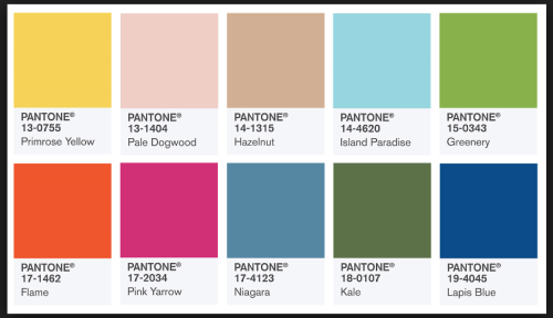
I’ve been on the hunt for the Spring and Summer Pantone colors for the year and of course I found them. I was expecting to see something more exciting, but the colors are so calming and as some of you know my style is sometimes a bit in your face! Color combination ideas are a process and sometimes you revert back those you’ve seen before.
I ‘ve been planning my spring/summer textiles and handbag release so there are a lot of moving parts to get things rolling. Most important to me are the color choices and style is second, but well discuss that later. Before I start to paint I like to play around with some of the colors to mix it up a bit to see how I will combine them. So far it’s been a tough decision and I’m looking for combinations to jump off the page.
I thought a different take on dots would be nice, but my program didn’t like my green and changed it to white.


I gave the stamp look a try with some of the colors:


Then I had a thought of a border print.

I may need a bit more time then I thought to figure this out and several extra minds to bounce ideas around!


well my fav colors are purples & greens! I’ve said before I’m not a fan of orange however once again I find myself drawn to the orange print & I find that is the one that pops for me. I also like the blue print. I like the green print but I feel it needs another color added to make it pop more.
LikeLiked by 1 person
Thank you, Debbie! I think I really need to spend more time playing around with the colors. 😊 I will work on adding more purple too. I think I only have one purple print and I will need your help on the purple colors and patterns since purple is not one of my favorite colors. 😊
LikeLike
I love purple, so this is a natural choice for me. Your orange and green pattern are very nice.
LikeLiked by 1 person
Thank you, Irene! I didn’t know that purple is your favorite color. I’ll keep you in mind for the purple weigh-in committee!
LikeLiked by 1 person
Thank you, Sheila 🙂
LikeLiked by 1 person
I think my favorite color is green, if I have to pick:-) And I liked your green print, but I think your blue print popped more for me.
LikeLiked by 1 person
These are beautiful! I can’t wait to see your purples! Maybe purple & fuchsia or lavender?
LikeLiked by 1 person
Thank you! I’m giving them a try.☺
LikeLike
I love the stamp color combination. Very vibrant and beautiful. As far as my favorite color combination… hmmm.. I guess it depends on my mood. Lately, I’ve been very much into navy blue and golden yellow as well as the classic black and white and the teal blue with the navy and gray with a beige or camel color…mixing neutrals.
LikeLiked by 1 person
You love color as much as I do! 😎
LikeLiked by 1 person